Streamlining Home Search with Personalized Accommodation Matching
Okaeri
UX/UI Designer · Responsive website · 120 hours · June 2023

Overview
Okaeri revolutionizes home search, focusing on user preferences with a friendly interface, personalized profiles, and in-depth surveys. Early tests received praise for reliability, customization, and simplicity.
Challenge
How can we create a system to match people with suitable homes based on lifestyle, simplifying the home-finding process?
Okaeri eases house-hunting stress by solving issues like unclear online listings, lack of transparency, and relocation hassles. It offers clear listings, convenience, and personalization through a chat-based system with profiles and questionnaires.
Solution
User-focused design guided its creation via polls, interviews, research, and competition analysis. The clean, friendly branding aligns with user preferences. User and task flows guarantee a smooth experience from signup to room requests.
EMPATHISE
Short Poll
User Interviews
Additional Research
Competitive Analysis
DEFINE
Affinity Map
POVs
HMW
User Personas
IDEATE
Card Sorting
Site Mapping
Task Flows
User Flows
Branding
PROTOTYPE
Lo-Fi Wireframes
Wireframing
Prototyping
TEST
Usability Testing
Prioritisation Matrix
Iterating
EMPATHISE
User Insights
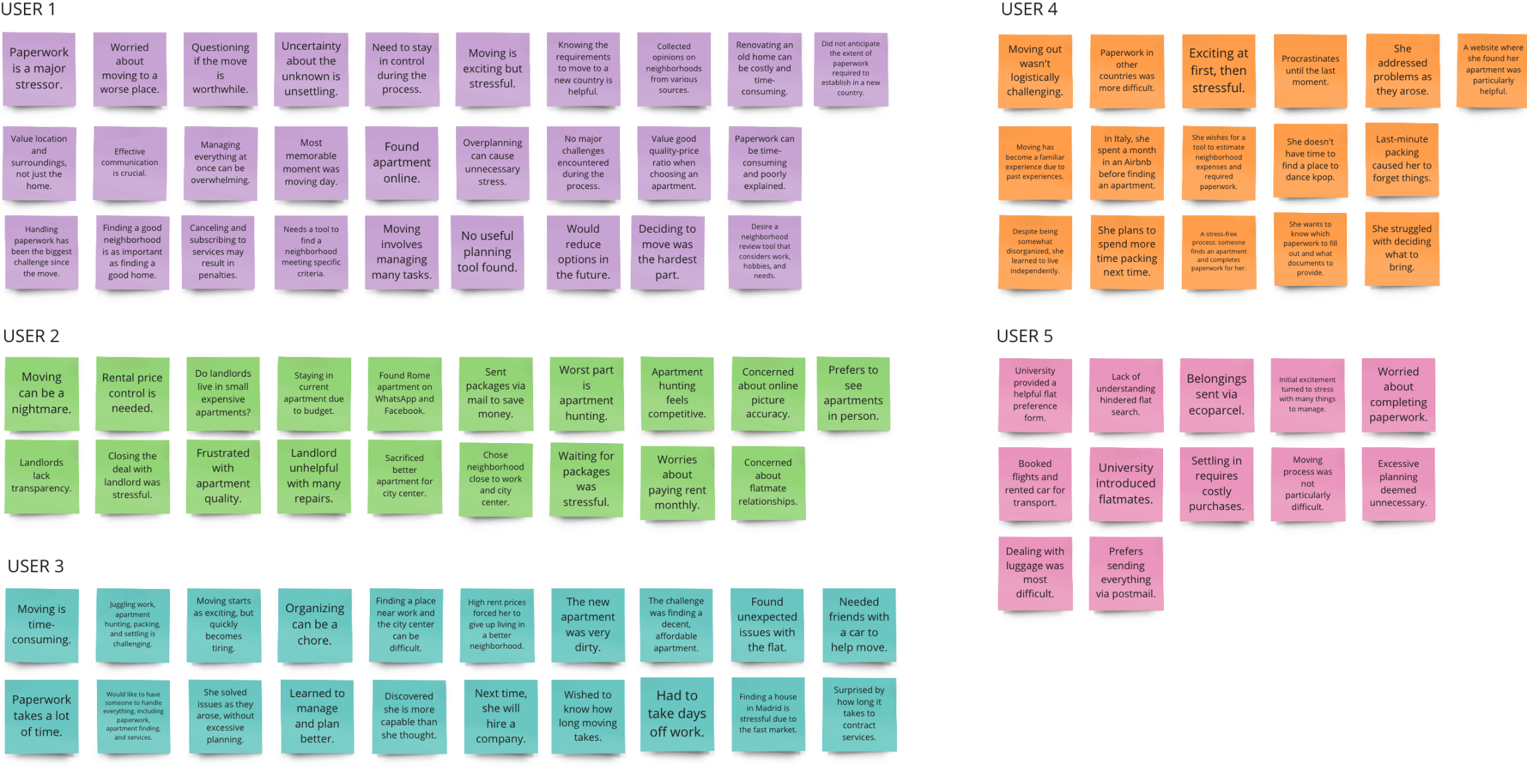
In the empathize stage, we aimed to help users with their moving process. We surveyed and interviewed home seekers to understand their needs. Our approach evolved into a transparent house-hunting platform, informed by housing market research.
Notes
Interviews
We conducted 5 interviews (30-45 mins each) to explore user experiences when moving to a new house. These interviews revealed key insights, prompting us to shift our focus to a new concept: a transparent housing website.
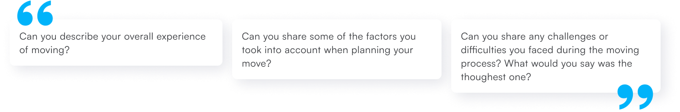
Example of questions asked
DEFINE
Paving the path
In Define, user interviews shaped our focus. We distilled insights into actionable housing themes. Affinity mapping organized findings, revealing patterns that shaped our design.
Common themes
Decent & Affordable Apartments
Searching for a suitable and budget-friendly apartment can pose challenges. It involves finding housing options that meet quality standards while staying within budget constraints.
Accurate Online Representations
The property's true essence is often not fully captured by images, and minimal information is typically offered in house descriptions, which depend on the landlord.
Transparency and Competition
Housing market opacity can cause uncertainty for users. Comprehensive information for a fairer experience is demanded.
Personas

Julieta · The Goal-Oriented Seeker
Julieta seeks compatible flatmates for an affordable, well-kept place near university and work. She aims to avoid constant repairs, overpaying, and long commutes. Challenges: tight budget and the effort to assess commute times.
IDEATE
Charting Journeys
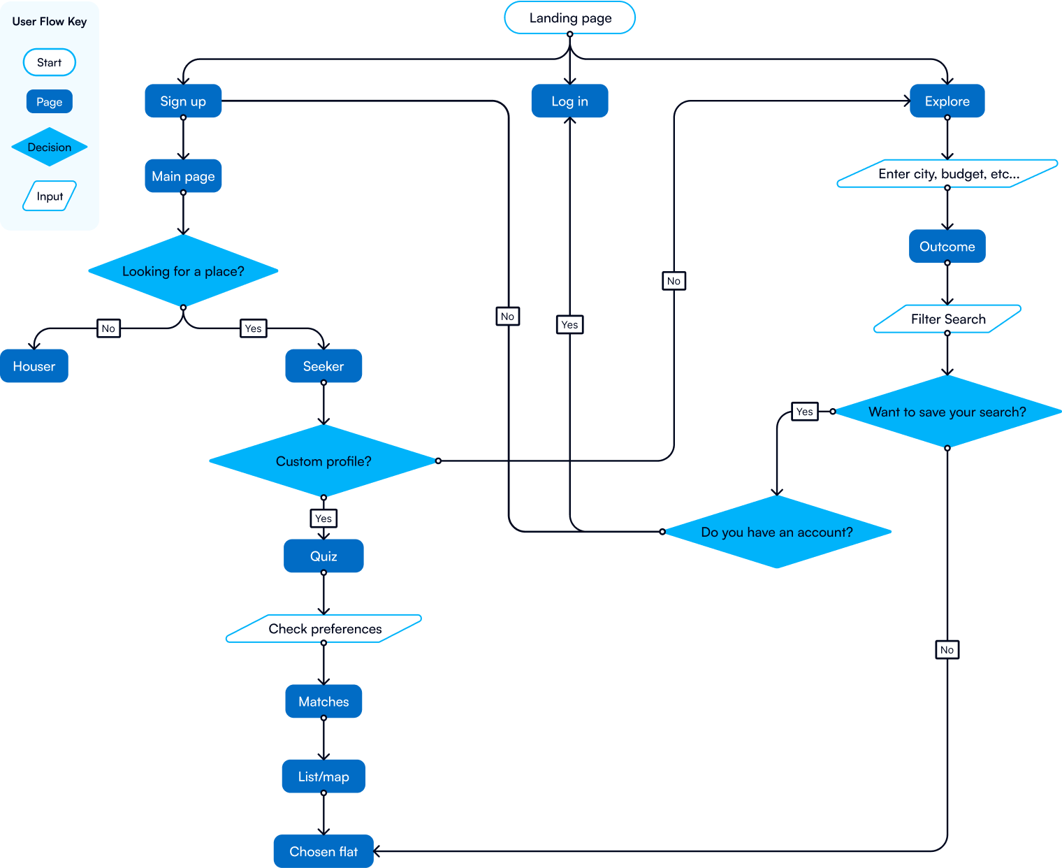
We used methods like Card Sorting, Site Mapping, Task Flows, User Flows, and Branding to craft Okaeri's blueprints. A clear sitemap aids navigation; user flows enhance engagement. Task flows boost efficiency meticulously.
User Flow
Molding the visual style
Our Okaeri brand combines approachability and boldness with a grid-based logo that radiates confidence and warmth. A calming blue palette symbolizes trust, and playful typography adds balance, encapsulating co-living's essence.
Logo

Typography

Colors

PROTOTYPE
Idea to Practice
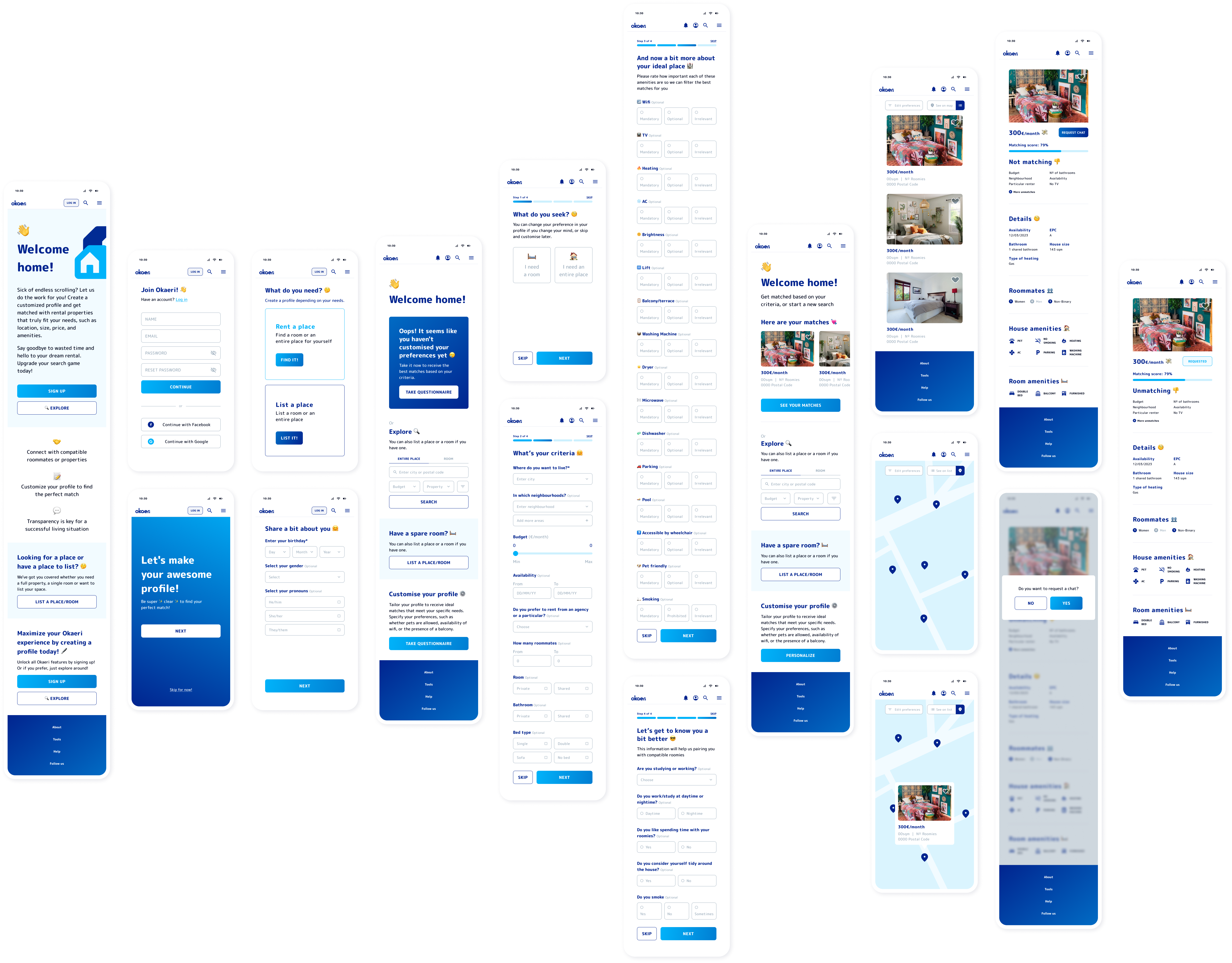
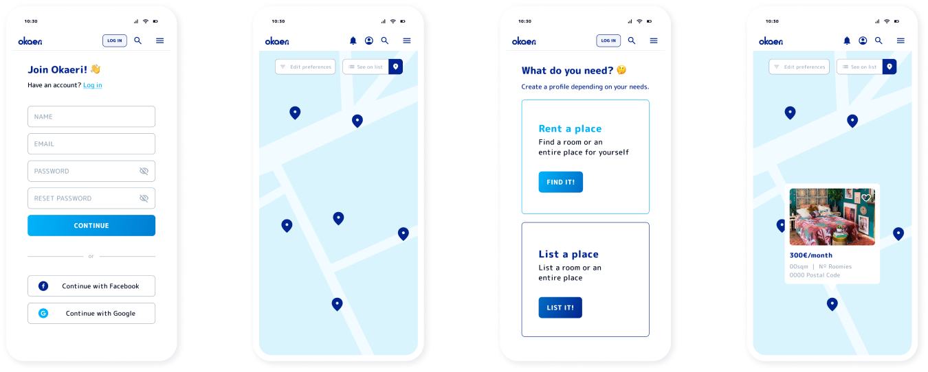
We used Lo-Fi Wireframes as the foundation for Okaeri's housing focus. Our detailed wireframing process built upon the established image, breathing life into the skeletal designs for vibrant results.
Mid-Fi Wireframes
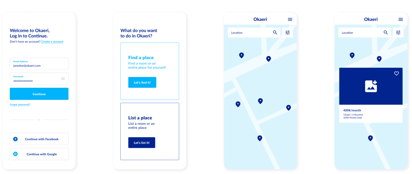
Hi-Fi Wireframes
TEST
App to the test
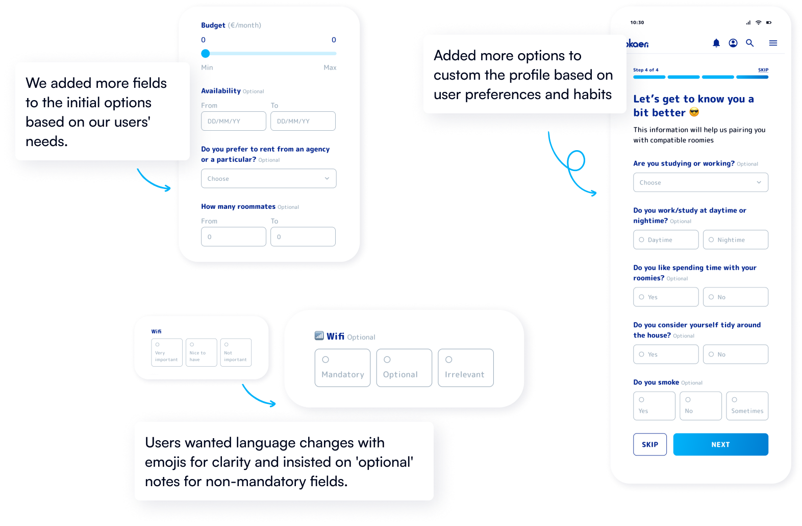
I shared my work with colleagues and tested it with five experienced users in the accommodation field. Their feedback praised the design's reliability and readability, citing icons and emojis. They did request an interactive map and more questionnaire personalization options.
User Testing
We tested the concept with 5 users, gaining valuable insights to inform our iterative process based on a prioritization matrix.
Iteration